
CONTENT
1. INTRODUCTION
This article addresses the issue of web accessibility and web design suitable for visually impaired. My ambition is not to write an exhaustive tutorial. There are certainly much better references on the Internet. My goal is to bring the problem of web accessibility to attention of web designers and show them that, with very little effort and a few tricks, they can make a world of difference to visually impaired people. In addition, accessible web content design should not be considered as just extra work done for some 2% of people living on margins of today's society. Arguably, content that is organized to improve accessibility for visually impaired is also more readable and better organized for sighted persons.
2. NAVIGATION ON THE INTERNET WITHOUT EYES
They say that humans receive 85% of external information using eyes. Obviously, it is a huge percentage to lose, be it external information or money on stock market. Fortunately, visually disabled people make up for that loss by improving other senses so after some time things are not so terrible as they looked at the beginning. For example, my mother who constantly expects that by some miracle, I will suddenly start seeing again, was in a state of shock when I warned her from a decent distance that she dropped her silk scarf and asked me "You saw it?". Also, I believe that my visually abled business partner gave up hope that my review of his write-up will ever pass without finding at least several typos. My explanation for that is that, when visually abled persons read text, they mentally conclude which word they are reading based on first several letters without paying attention to the remaining part of the word. On the other hand, visually disabled persons are forced to hear the entire word and, trust me, it really hurts sensitive ears to hear the word "Internet", due fat fingers misstyped as "Interent".
In order to understand how a blind person communicates with a computer, try to close your eyes while someone reads you sequentially text on the screen. In reality, that other person is a screen reader, software designed for that purpose. First, in such a way you lose spatial information about objects on the screen. Second, you don't have information about graphic objects, unless someone describes to you the content of pictures. Third, unless helped with the appropriate organization of navigation, you have to traverse sequentially the entire content that comes before information you want to reach.
Visually abled persons have problems to understand how it lookss like working without eye sight even when they professionally work with blind people. I have heard a funny anecdote from a blind guy who consulted a company that worked on development of a Serbian screen reader. He had problems to explain to the visually abled software developer what was the problem with the installation procedure. Finally, he turned off the monitor and told to the developer to do installation without the monitor. The developer jumped and said "But I don't see anything." and the consultant replied "Now you have got the point.".
Visually abled persons primarily use mouse (or even touch screens) to navigate the Internet. They can visually review the screen and then directly access objects of interest on the screen (e.g., buttons or links). On the other hand, visually impaired people use almost exclusively keybord. My mouse is burried somewhere in the mess on my desk and I have to dig it out when someone else needs to use my computer. Using the keyboard, the screen is scanned in a sequential manner until the point of interest is reached. A typical web page on a site like Amazon, CNN or BBC has between 100 and 300 links, so you can imagine that it would take forever to scan them sequentially until the desired one is reached.
Now when we outlined the above problems we understand that the primary goal of good design for accessibility is twofold:
- to shorten the sequential scanning process and allow skipping of unwanted content;
- to facilitate understanding of graphic content.
- "h" jumps to the next heading,
- "1", "2", etc. jumsp to the next heading level 1,2,etc.,.
- "G" jumps to the next graphics,
- "tab" jumps to the next link,
- "l" jumps to the beginning of the next list,
- "t" jumps to the top of next table,
- "f" jumps to the next form field on the page, etc.
3. USE OF HEADINGS
In this section, we will address how to use headings, i.e., HTML tags <h1>, <h2>, <h3>, etc. The title of this section is heading level 3, and when a screen reader reaches it, it will say "Heading level three three use of headings", thus it will tell us the name of section and its position within overall context of the page. Note that the first "three" is the heading level while the second "three" is the sequential number of the section as it can be seen on the section title. We can jump from heading to heading (all levels) by pressing key "h" or we can skip from heading to heading of certain level by pressing the appropriate level number, e.g. 3.
In sucha way, we can quickly skip over unwanted sections and reach the desired one. Unfortunately, many web designers either don't use headings or use them to control fonts and visual appearance of text. An example of horrible web design is FaceBook where, until recently, many lines were under headings. Besides lost ability for quick navigation, it is pretty annoying to hear e.g. "heading level three" at the beginning of many consecutive lines. To cut the long story short, use headings only to separate logical units of text and not to change font. If you want to change fonts use cascading stylesheets (CSS) and HTML attribute "class" defined for <p> or <div> HTML tags.
4. GRAPHIC CONTENT
They say that a picture is worth a thousand words. In case of visually impaired people it is the other way around. Even one word is infinitely more valuable than a thousand graphic jpg and gif files. Pictures are placed in web pages using HTML tag. Screen readers are not capable of understanding pictures and web designers have to help them using "alt" and "longdesc" attributes. The following table shows the same picture with different HTML tag attributes. Visually, the picture looks same. However what we hear from the screen reader is different. The table shows the picture, HTML code, and some self-explanatory comments.
| Picture | HTML Code | Comments |
|---|---|---|
Picture starts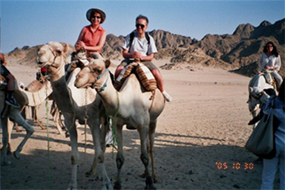 Picture ends |
<img src="images/camel.jpg" width=100>
|
This is the worst you can do for the screen
reader. It will not be aware of the picture and it will remain mute while
scanning with arrow keys over the picture. Text above and below the picture is for the benefit of users of screen readers because no sound will be produced by the <img> between the two lines of text. The picture will truly be
invisible to a visually impaired person.
|
|
|
<img alt=. src="images/camel.jpg" width=100>
|
Now when alt attribute has some value
("." in this case), the screen reader is aware of the picture. In
this case it will just say "Graphics" and notify you that you are
scanning over some picture but without any information about it. Note that
some HTML editors put "." or "null" as default values of
alt attribute and it is duty of web designers to put some meaningful value.
|
|
|
<img alt="Dragomir and Jasmina ride camels" src="images/camel.jpg" width=100>
|
Now alt option has some meaningful and descriptive value and screen reader will say "Graphics Dragomir and Jasmina ride camels" |
|
|
<img longdesc="images/camel.html" alt="Dragomir and Jasmina ride camels" src="images/camel.jpg" width=100>
|
In case of a complex picture that requires long description, you can use this most comprehensive option. Screen reader will say "Graphics Dragomir and Jasmina ride camels. Press enter for long description". If you press enter, a new HTML page defined in the longdesc option will pop-up and it may contain arbitrarily long and detailed description of the picture. In most of the cases you will not need this option. However, if you want to make accessible a chart with numbers or enumerate all people in some picture, you may choose to use it. I suggest that, depending on the structure of your site, you keep these files with long description either in a separate folder, or keep them together with graphic files and give them the same name as the corresponding graphic file (of course with the appropriate file name extension). |
5. GRAPHIC LINKS
Similar to what has been described in the previous section is the issue of graphic links. Designers often use graphic links, especially in menus in the left-hand side of the web page. Here is what I found on one real site on the Internet:
<a href="overview1.jsp"><img name="menu_2" src="images/menu_2.gif" width="67" height="69" border="0"></a>.
And here is what the screen reader told me:
"Link graphic images slash menu underline two".
I had to click on that link to find-out that behind the link is page entitled "What we do - overview". You already guess, a friendlier solution is to place title of the target page in the "alt" attribute of the original image of the link.
6. USE OF TAG WORDS
Although use of headings allows fast scanning over the page, sometimes use of some unique words in headings can eeven more expedite scanning of page, especially if the page is frequently used by the user. Every person will find his or her words characteristic for intended content but web designers might help that process. For example, my tag word on BBC News is "last" which immediately brings me to heading "last updated" where are the latest news. Similarly, although CNN has more than 100 links, by searching for "latest" I quickly get to the beginning of latest news. Of course, it is a good idea to preserve these key words for people who are used to them and periodically visit your site.
7. USE OF SHORTCUTS
One thing that I find very annoying is sequential traversal over left-hand side menus that may be very lengthy. Namely, when you jump from page to page on the same site, the screen reader cursor is positioned on the top-left corner of the screen. Then you have to go over the menu on the left-hand side which is usually the same on every page of the site. There are several solutions to this problem.
It is possible to asign shortcuts for quick access to some frequently visited places on the page so for example Ctrl+1, Ctrl+2,... may be assigned for quick access to some frequently used links, form fields or buttons. Personally, I don't use them, but many people do, so it is something to think about. You may see how it is implemented on the very good afforementioned BBC site. Use of shortcuts is usually documented with a list of shortcuts available on the page.
One solution are so called "accessibility links". Web designers who really care about accessibility, place at the top of page at least two links that jump internally within the page to points of interest. The two minimal points of interest are the beginning of page navigation links (usually top of menu on the left-hand side) and the beginning of page content. This is very useful since this is the quickest way to reach the point with navigation links or the beginning of the actual page content. However, I believe it could be nuisance to visually abled persons to see at the top of each page these links that are not used by visually abled people. In addition, these links take up screen real estate space. Since these links are used by blind people only, they can be made invisible but audible using graphic links. In this case, graphic file is 1x1 transparent pixel GIF file and of course the "picture" is made audible using "alt" attribute as:
<a href="#toc" accesskey="t" ><img src="images/transparent_pixel.gif" alt="Skip to table of content"></a><br>
<a href="#introduction" accesskey="c"><img src="images/transparent_pixel.gif" alt="Skip to content"></a><br>
and of course at the appropriate place you have to put the corresponding anchors
<a name="TOC"> </a>
<a name="introduction"> </a>
If you want, you can download the transparent pixel GIF file here. Anyway, I found it in Internet temporary files cache.
Note the <br> HTML tag at the end of each line that define the graphic links. I found it necessary since for some reason, Internet Explorer and FireFox have different behavior. If you go over these links using down-pointing arrow, Internet Explorer will properly stop on the first link so you have to press down-pointing arrow to go to the next link. On the other hand, without this tag, FireFox will read the two links one after another without stopping. To stop on the appropriate link, you have to use "tab" key. Similar thing happens with lists and <li> HTML tags. Without the break line tag, FireFox reads the entire list without stopping like in the "Other news" area on the CNN's home page. It is pretty anoying to hear the entire list of news when you want to read them line by line an slowly digest news. A solution is to go through these lines/links using "tab".
-
A frequently
used solution is to place a "skip to content" link in the top left
corner which makes a jump internally within the page and the beginning of content is labelled using anchor like
<a name="content">. - A simpler solution which I personally prefer is to start content with heading level 1 so the reader may skip to content by pressing "1" or "h" keys.
- In case of a long text, it might be a good idea to create a table of content with links used to jump to the beginning of a new section, as it can be seen on this page.
In such a way, one can choose either to go sequentially through the menu or skip directly to the actual content of the page.
8. LANGUAGE ISSUES
Depending on installation, screen readers may have multi-lingual capabilities. Screen reader communicates with the computer and receives a stream of characters that have to be pronounced. The way character stream is interpreted and pronounced depends on the currently active language synthesizer. The problem may occur when language of the character stream and the language synthesizer missmatch. Then it may sound like for example, an Englishman who does not speak French tries to read French text.
Most of the time, screen readers use the default language that was set-up by the user. However, it is possible to force them to change language within an HTML page using "lang" attribute. That may happen if for example in a French text you need to insert some English quotation from Shakespeare. I believe that very few web designers (if any) think of changing language in the page when change language of the text.
Generally, tools for web design insert into web pages language information of the locale set up on the computer used by the web designer. The problem occurs when the language of the text differs from the computer locale. For example, once I planned to visit a recommended restaurant in Germany and searched information on the restaurant's web page. The page was written in English but the default language code ("de" for German language) set by a German web designer read the text as a German person who does not know anything about English so I had to use some tricks to read the page.
Things may be even funnier. Once I received an HTML email from a friend who somehow picked up Portuguese language code. It was hillarious to hear Serbian text with Portuguese prononciation and Brazilian accent ("pt-BR" language tag).
Now let's see how to control language in web pages. Consider the following HTML sequence:
<p lang="sr">srpski</p>
<p lang="fr">Français</p>
<p lang="it">Italiano</p>
<p lang="en-GB">English-Great Britain</p>
<p lang="en-US">English-United states</p>
which will produce the following output
srpski
Français
Italiano
English-Great Britain
English-United states
The screen reader will first find change to Serbian language. Since my primary screen reader does not speak Serbian (I have another one for that purpose) it will admit that fact by saying in the current language (English) "Serbo-Croat" and read the word as an English-speaking person would do. Since the following four synthesizers are available (including British and American version of English), the reader will properly read text without any announcement about the change of language.
Finally, language set-up in the above example has local validity within the paragraph. If you want to set language on the level of entire page, you have to do it in the <html> or <body> tags. If you want to have a limitted scope of certain language that spans over several paragraphs and pictures (including textual description of pictures), you can enclose this sequence of HTML code with <div lang="en">...</div>.
9. COLORS
For people like me, colors have no meaning. However, there are people who can see but are color blind i.e., they see things in black and white. Have them in mind and, before releasing your web design, turn off colors on your screen and verify appearance of your design. It may happen that your favorite combination of collors is close when seen as black and white and details become indistinguishable.
10. HTML FORMS
Generally, labels of form fields may be placed in different positions with respect to the field itself (e.g., left, right, top of the field). In addition, labels may be physically separated from the field by some other objects/text on the page. In such a way, relation between the label and the field may be lost. To help the screen reader to connect the label and the field, it is a good practice to mark text of the label using HTML tag <label> such as:
<form>
<label for=name>Your name</label><br>
Some other text<br>
<input id=name type=text name=your_name/>
</form>
This will produce the following form:
We may access this field directly from another part of the page by pressing shortcut "f". When we reach the field from far away, the screen reader will correctly say "Your name edit"announcing that we reached an editable field labeled as "your name" despite the fact that the text of the label is physically separated from the field itself.
There is a problem with accessibility that is related both to forms and graphics that I often encounter on the Internet. Submition of comments and inquiries to owners of web sites is often done via forms. In order to avoid spammers and automated submission of a large number of inquiries, the submitter has to retype a randomly generated password drawn on apicture (CAPTCHA - Completely Automated Public Test to tell Computers and Humans Apart). Obviously, use of the "alt" attribute would defeat the purpose of the use of graphic file since a computer generated attack would be able to read the password. Sometimes, such a web page is equipped with a link to an audio file that reads the password. In order to avoid automated voice recognition, such audio files are scrambled, often to much so one cannot recognize content. Other owners of web sites forget that there are people who cannot see and ironically, next to the picture of password is the instruction that the submitter should retype the password seen on the page, as if all site visitors can see.
11. CHANGE OF FONT SIZE
People with low vision i.e., those who can see somewhat, mey require large fonts. Some sites provide buttons/links that programatically increase/decrease font size and keep it that way during the entire user's session on that site. This can be done using Java scripts that you can easily find on the Internet. I might be subjective because large font cannot help me, but I don't think that this feature is a must. Namely, everyone can adjust font size individually locally on the browser. It is even possible to define a personal stylesheet that shows web pages in certain way (colors and fonts) irrespectively to what the web designer defined on the site.
12. OTHER REFERENCES AND RECOMMENDATIONS
As I mentioned at the beginning of this article, I had no intention to be exhaustive with details. The idea was to giv personal and subjective view to the problem of web accessibility, and to encourage web designers to at least try to make web more accessible with a minimal set of tricks.
Undoubdtly, the best authority on the issues of web accessibility is World Wide Web Consortium (W3C). They defined the "W3C-WAI Web Content Accessibility Guidelines 1.0" which prescribes formal rules for evaluation of web accessibility.
I learned the hard way in the US and Serbia, that protection of people with dissabilities defined by laws and constitutions is just a hoax and I don't expect any protection from anyone. Nevertheless, the "Americans With Disabilities Act" (ADA) is very well implemented site and should be looked at as a reference implementation. Also, I like very much the BBC News site.
Although Google has national sites (French, Italian, Serbian, etc.) with content written in various languages, it does not take care of language attributes so the screen reader does not switch to the corresponding language speech synthesizer. In addition, Google is not consistent with use of <label> HTML tag as if two different teamse created different pages with forms. The search form does not use this tag so when screen reader arrives to the search form, it just says "edit", while input fields in the sign-on form are properly equipped with <label> tag so besides saying "edit", the screen reader properly says name of the field.
If you want to see how NOT to implement site for better accessibility, check-out FaceBook and CNN sites. As previously mentioned, until recently, FaceBook abused headers to change fonts so it sounded very annoying to hear header levels on numerous consecutive lines. Despite this recent improvement, handling of graphic objects and buttons is inconsistent so often one cannot understand function of a button. The CNN site is pretty cluttered and difficult to navigate since it does not have navigation organized in a structured way. As I use it on a daily basis, I had to develop my own navigation strategy, mostly using keywords to reach places of interest.
Several years ago, I had pleasure to serve as an advisor during the redesign of web site of KBC Bezanijska Kosa Medical Center - one of the first Serbian web sites adjusted for the blind people. I have visited this site while writing this article. It is still in a pretty good shape although I noticed some pictures that are not friendly to screen readers. Also, it is my privilege to be in a position to advise web developers of International Blind Sports Federation (IBSA) web site.
The Disclaimer: All comments about sites are strictly my personal opinion and subjective perception of them and should be treated as such.